Frankie RivieraWebsite Showcase

E-commerce websites

A store page has one job: get a shopper from interest to a confident checkout. Show the full price early, prove the product in detail, and remove every reason to leave the cart.

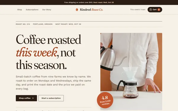
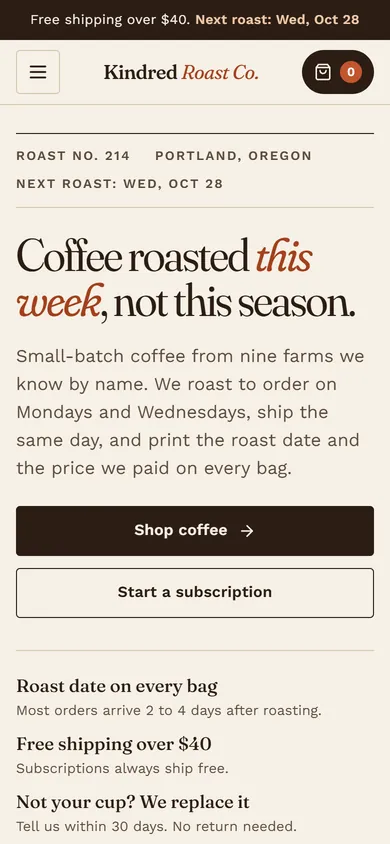
Home page of the Kindred Roast Co. concept Phone view of the Kindred Roast Co. concept

Concept 1 of 3 · Portland, OR

Kindred Roast Co.

Editorial Roastery

A coffee store set like a magazine, with roast dates, farm prices and a cart that follows you.

A small-batch roaster that sells online and wants recurring subscription revenue.

  • Cart drawer that persists across pages
  • Four-step subscription builder
  • Grind and size variants with price per ounce
  • Shop filters with removable chips
Fraunces + Work Sans6 pages
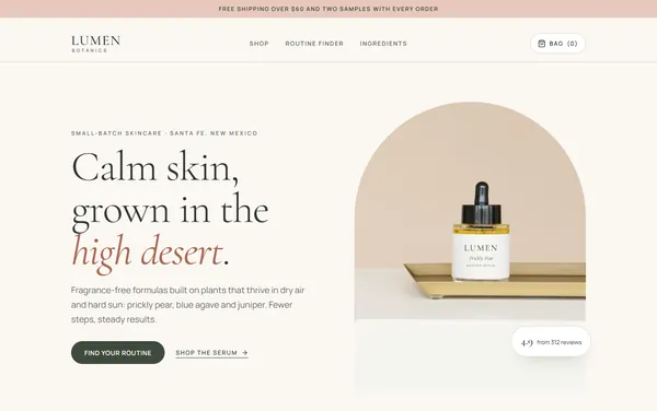
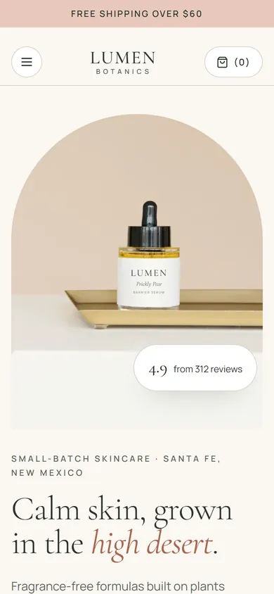
Home page of the Lumen Botanics concept Phone view of the Lumen Botanics concept

Concept 2 of 3 · Santa Fe, NM

Lumen Botanics

Soft Minimal Luxury

A calm skincare store with a three-question routine finder and reviews you can filter by skin type.

An indie beauty or wellness brand that sells a small line and wants bigger orders per customer.

  • Three-question routine finder with bundle pricing
  • Reviews filtered by skin type and rating
  • Bag drawer that persists across pages
  • Free sample picker
Cormorant Garamond + Manrope6 pages
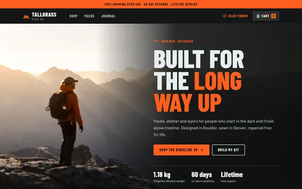
Home page of the Tallgrass Trail Co. concept Phone view of the Tallgrass Trail Co. concept

Concept 3 of 3 · Boulder, CO

Tallgrass Trail Co.

Bold Athletic

A dark, high-energy gear store with a trip-based Gear Finder that builds and prices a full kit.

An outdoor or sporting goods brand with technical products and buyers who compare specs.

  • Gear Finder with live kit price and weight
  • Color swatches that recolor the product
  • Size guide with torso fit check
  • Cart drawer with free-shipping meter
Barlow Condensed + Barlow6 pages

The research

What an e-commerce website has to do

Every concept above covers these. They come from the research pass for this niche.

  1. Total cost before checkout

    Extra costs are the top reason shoppers abandon checkout. Show the shipping threshold and an estimated total by the buy button.

  2. Return policy at the buy button

    60% of shoppers look for return details on the product page. Link it beside Add to cart, not in the footer.

  3. Variant buttons, not drop-downs

    Buttons show every size, color and grind at a glance. Drop-downs hide choices and stock status.

  4. Photos that show scale and use

    42% of shoppers judge size from images. Show the product in hand, in use and up close.

  5. Reviews that answer objections

    Rating breakdowns, filters and replies to critical reviews build more trust than a row of stars.

  6. Guest checkout, short form

    Forced accounts and long forms each push close to 1 in 5 shoppers out of checkout.

  7. Delivery dates up front

    Slow or vague delivery drives 20% of abandonment. Show the ship date and arrival window on the product page.

  8. Built for thumbs, fast to load

    Keep Add to cart in reach on phones and get the main image on screen in 2.5 seconds or less.

Run an online store?

Pick the concept closest to your style and tell me what to change. Your site gets built on the same process and hosted on Azure.

Start a project